Dr. Order is on standby.


PLAYERS: 1
PUBLISHER: FCI
DEVELOPER: Marionette
GENRE: Adventure/Platformer
RELEASE DATE: November 1988
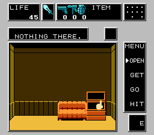
Dr. Chaos, you stand charged with confusing/boring the crap out of the good gamers who have tried to play your game. What say you?! I know what I say: Dr. Chaos tries desperately to be a hybrid of a side-scrolling action game and a first-person adventure, but like so many “experiments” on the NES in the late ’80s, it ends up exploding in one’s face. You, as an 8-bit Bob Saget, are thrust outside of a mansion with bats, rodents, and other miscellaneous vermin to stab. Once you enter one of the several doors outside the mansion, the perspective switches to first-person. From here, you collect handgun bullets, grenades, health, and… that’s it, I guess? All you do are open doors, windows, cabinets and collect things. The interface can be confusing. You can move north, south, east or west in any of the doors you enter, but in order to do so, you have to move the hand cursor all the way to the left or right of the screen. There doesn’t seem to be any pattern or reason to these areas. Collect what you can, then make it outside, but there’s nothing to do outside either. Am I saying that Dr. Chaos is a completely pointless game? No, because perhaps in one’s hours-long progress with the game, something could very well happen. In my relatively brief playthrough, however, nothing did.
D
Latest posts by Dylan Cornelius (see all)
- By Request – New Ghostbusters II - April 4, 2014
- The 86 Worst NES Games – Part 4 - April 1, 2014
- The 86 Worst NES Games – Part 3 - March 29, 2014

6 replies on “#193 – Dr. Chaos”
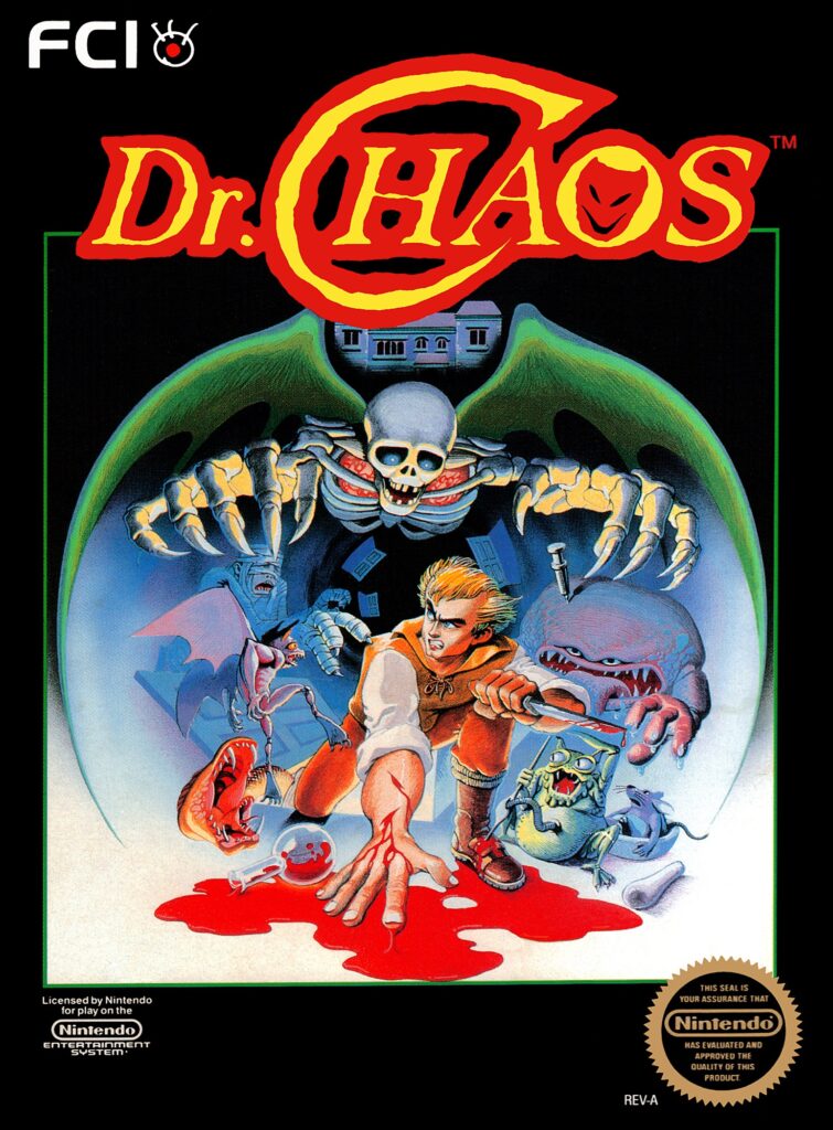
The screenshot looks okay, the box art is a bit graphic with the blood…well, for its time anyhow.
The box art is the best thing about this game. Look at how cool it is! That was how game companies lured your prepubescent mind into thinking that the game was going to be freaking awesome. Just look at that screenshot! What a pile.
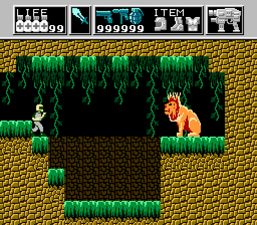
This game was incredibly hard. It was a long time before I realized that there were so called “warp zones” that lead to strange side scrolling stages with actual monsters and such! Once you figure out where these “warp zones” are, the game becomes much more interesting….but still balls ass hard!
Definitely. I should probably give it another go… but I won’t.
Yes! The cover art got me renting this game once every 2 weeks back’en. As a non-english speaking youth, the cover art was all this game had to offer me, I couldn’t even ask Nintendo Power for help.
I saw a video review some time ago and learned of the warp zones. If you haven’t been in one, you haven’t played the game. It’d be like zooming in cars, smashing pedestrians and shooting at cops in GTA without ever triggering a mission.
In the end this game does fall in line with Zelda II, Metroid and other non-linear-ish platformers on the NES. And it’s actually half-decent.
I learned that this game was originally supposed to be licensed for that movie House with Richard Moll.